January 9, 2021
Slideshows
January 9, 2021


I've been working on another website lately, but it uses the same code base as this one, so all of the improvements get carried over. The latest thing I've done is a complete rework of the slideshow plugin.
First, I stripped out a lot of fat - unused features, ugly themes, 'call-homes', etc. I hardwired some stupid options, added some new ones, fixed a few major problems, and made it much faster. Finally, I put the whole thing through the wringer and got rid of anything that was not strictly needed, everywhere - PHP, JS, CSS. My version is less than half the size of the original.
The result is a yuge improvement, both on the front end, and especially on the back end:
- Image selection was basically crippled and unusable if you had more than a few images in the WordPress Media Gallery. Now I can search out any image I want.
- Nivo Slider has no real random capability, but I added a feature that convincingly fakes it - you'd have to analyze it for quite a while to detect that it is not truly random.
- I cleaned up the display and got rid of the hazy borders that just make your screen look dirty, and got the slide captions working. ( That was actually a bug in my WordPress theme. )
- I fixed the navigation arrows so they are visible against any background, and then moved them out of the way in the upper corners.
- I set the defaults for new slideshows to values that actually make sense, so I don't immediately have to change everything.
- I added my caching 'technology' so that the slideshows are no longer re-generated on every page load. The result is that they have almost no impact on performance.
My slideshow plugin may not have all the bells and whistles of some others, but I think it is now better than anything else I have seen.
Update:
I added the option to place the captions below the slides, rather than inside them. This allows for long multi-paragraph captions that would otherwise cover up the image. This is something that bugged me from the start. I also tweaked the user interface to make it easier to create those long captions.
By default, slide captions now come out exactly like regular image captions, and I don't have to do anything. I'm not using that in this site, because I like the old way better here.
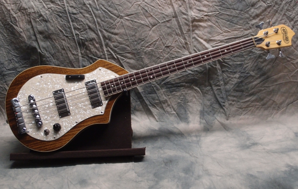
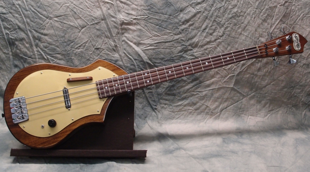
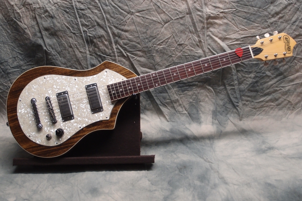
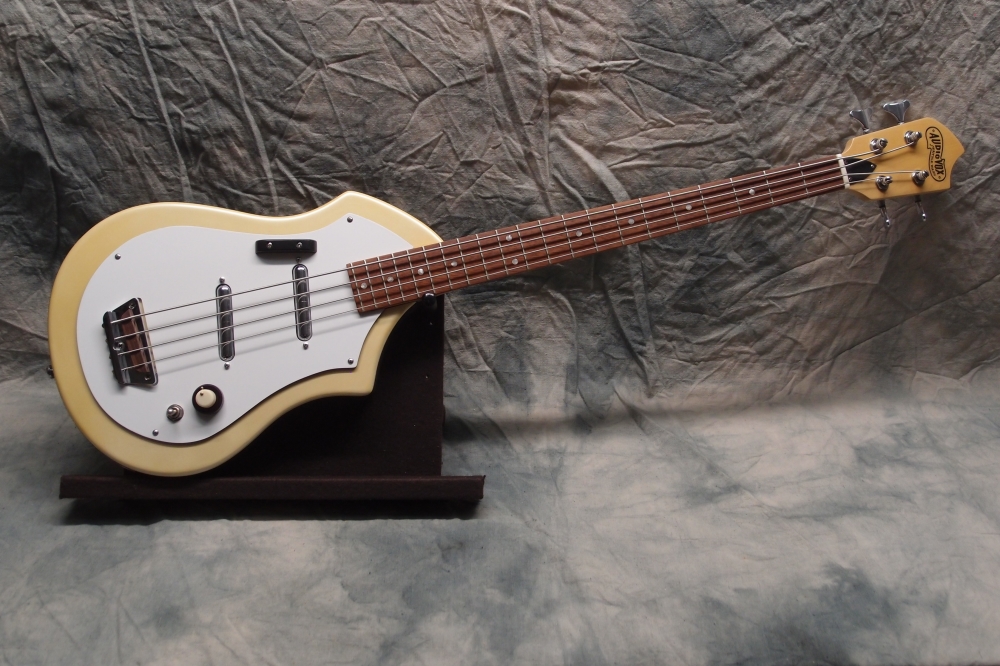
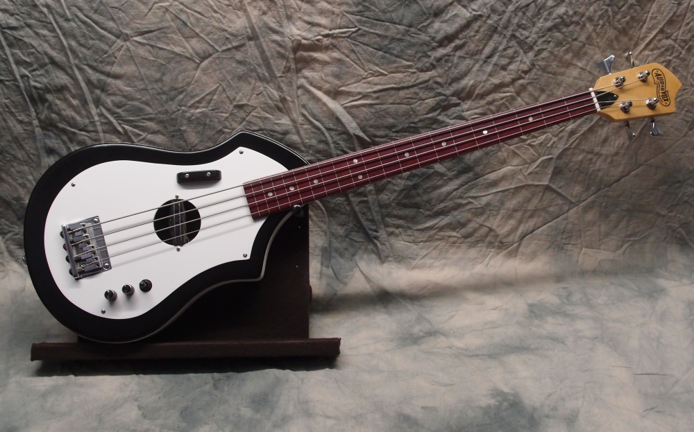
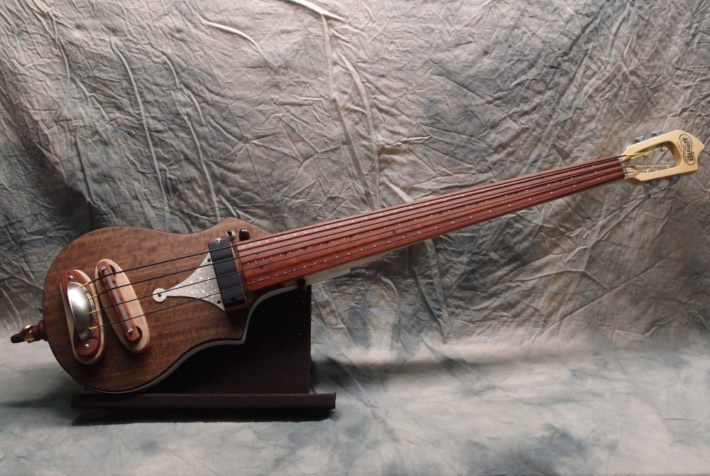
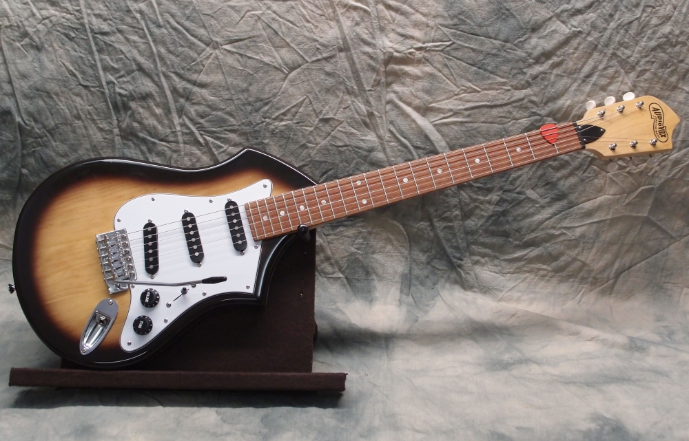
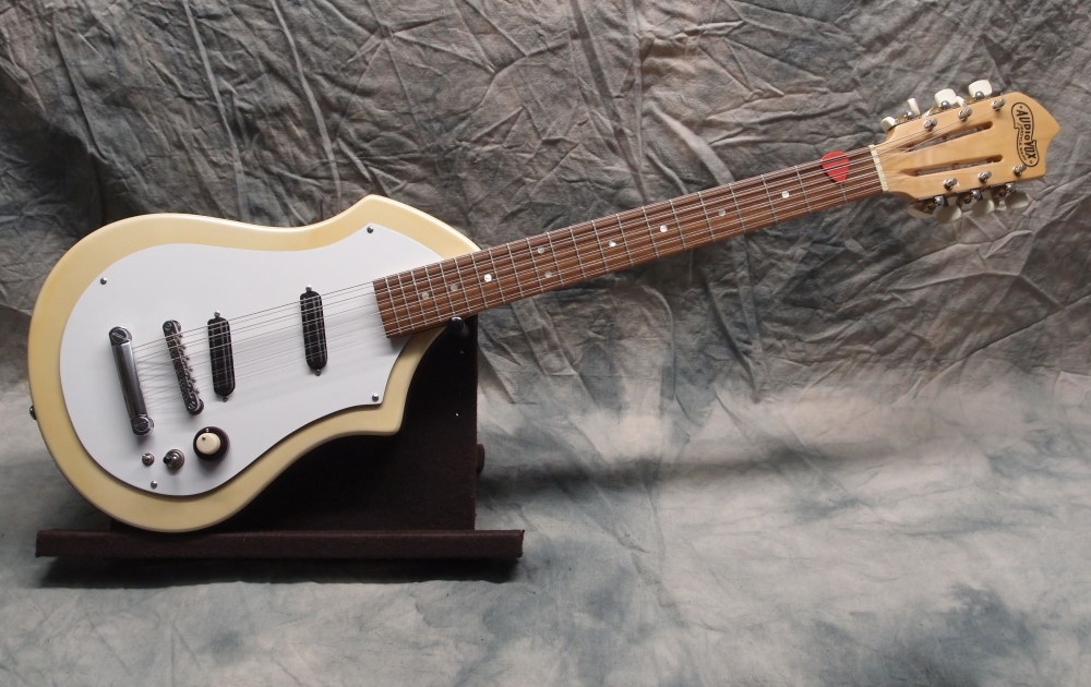
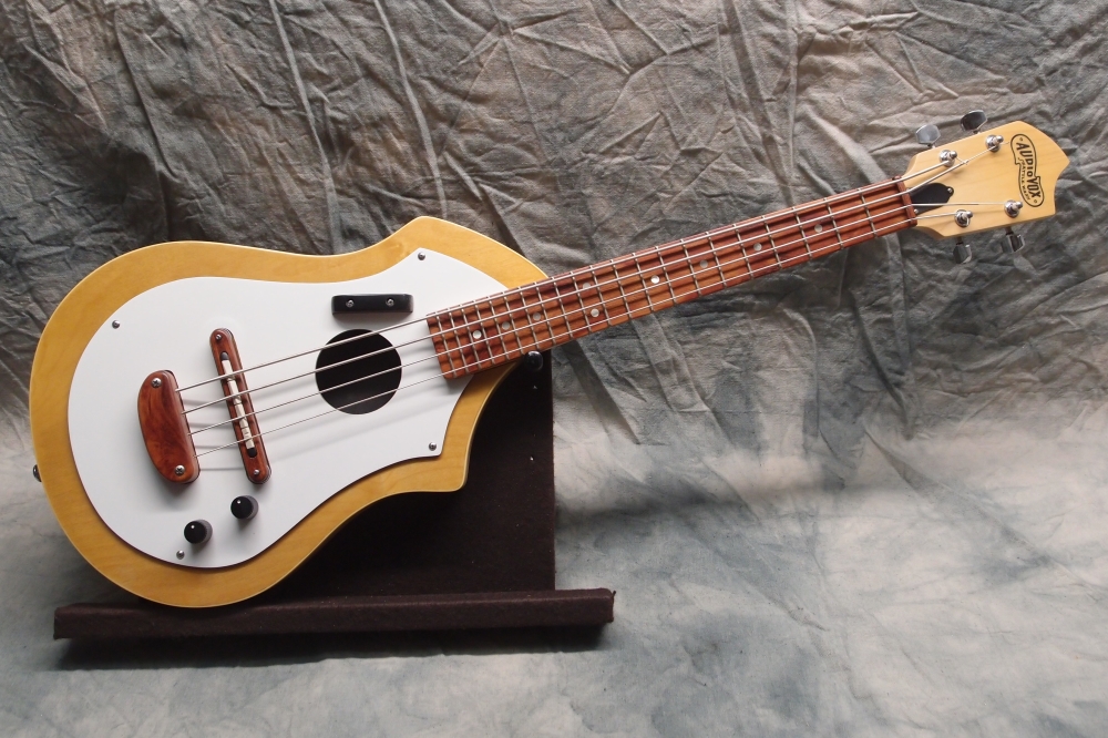
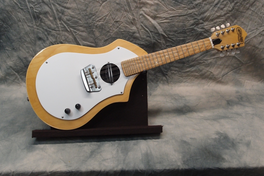
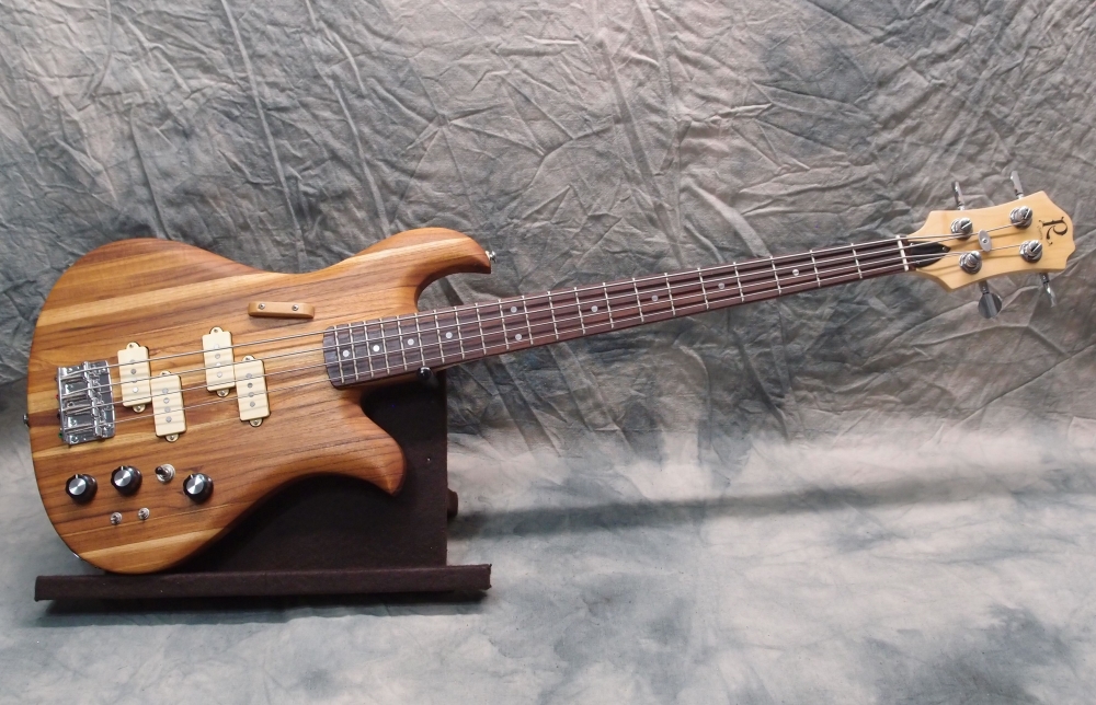
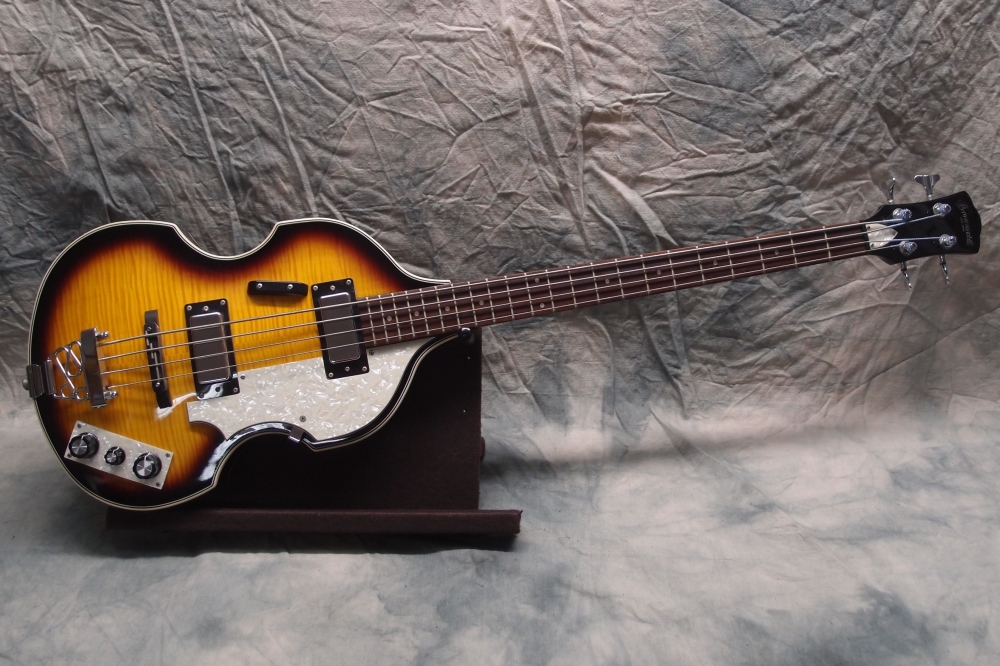
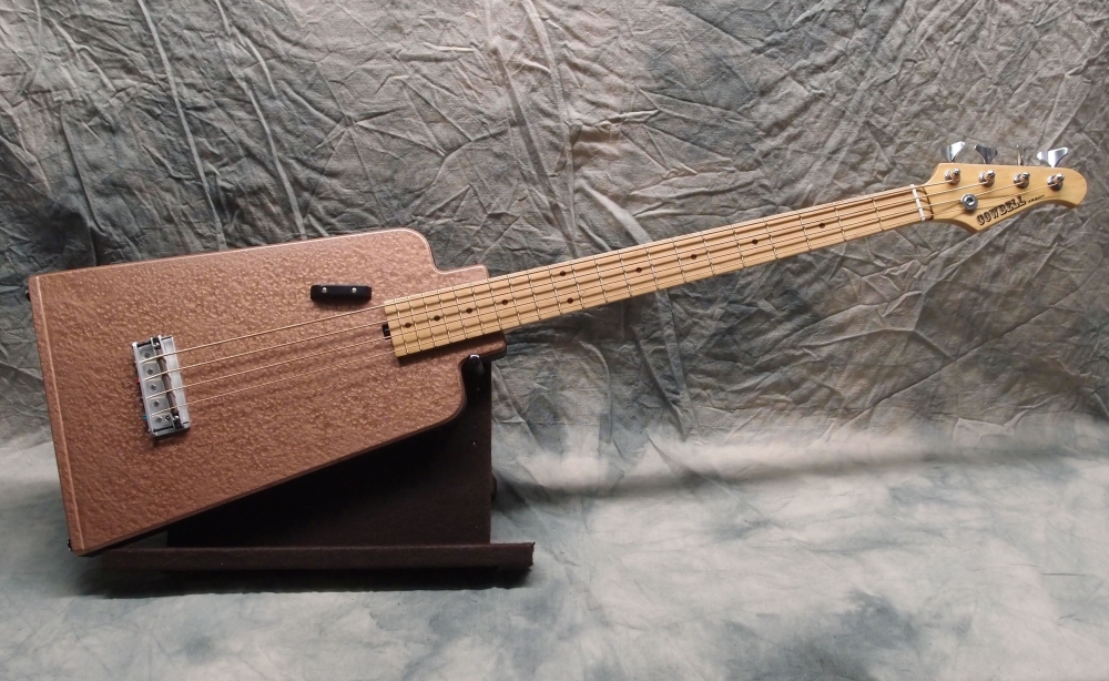
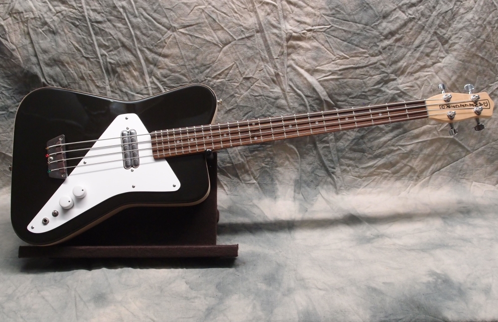
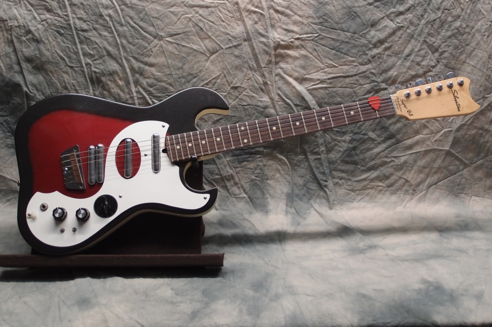
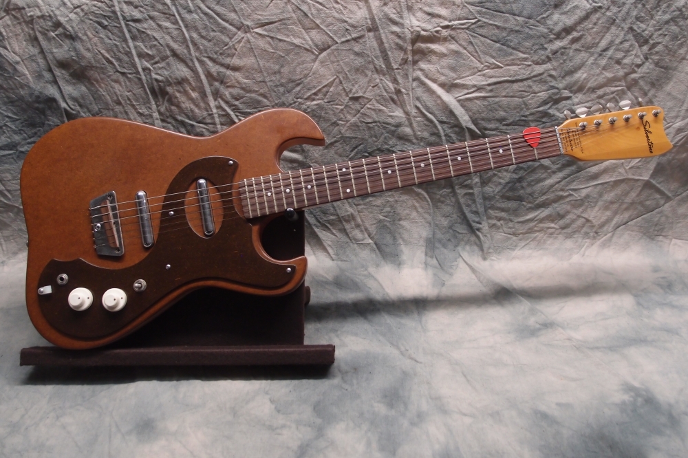
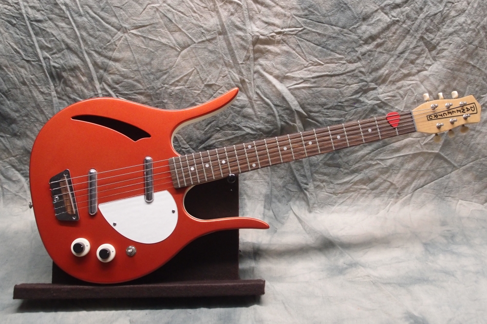
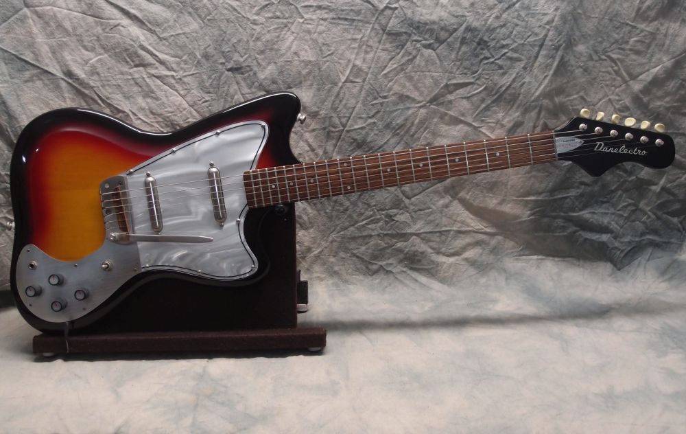
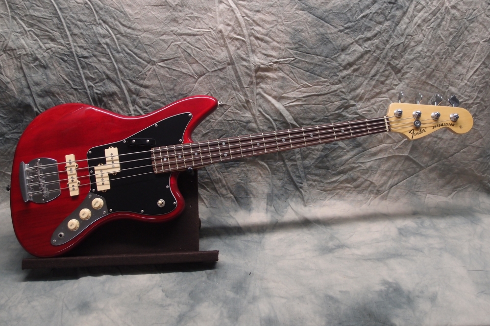
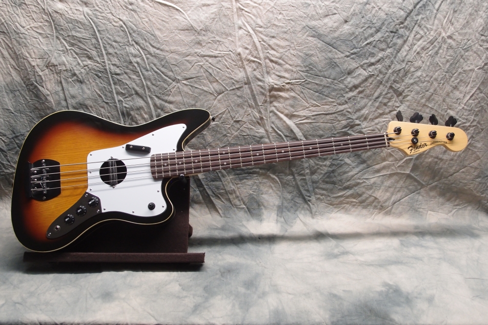
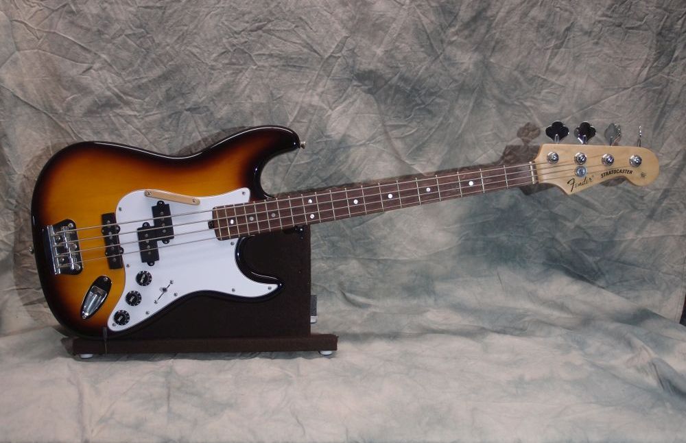
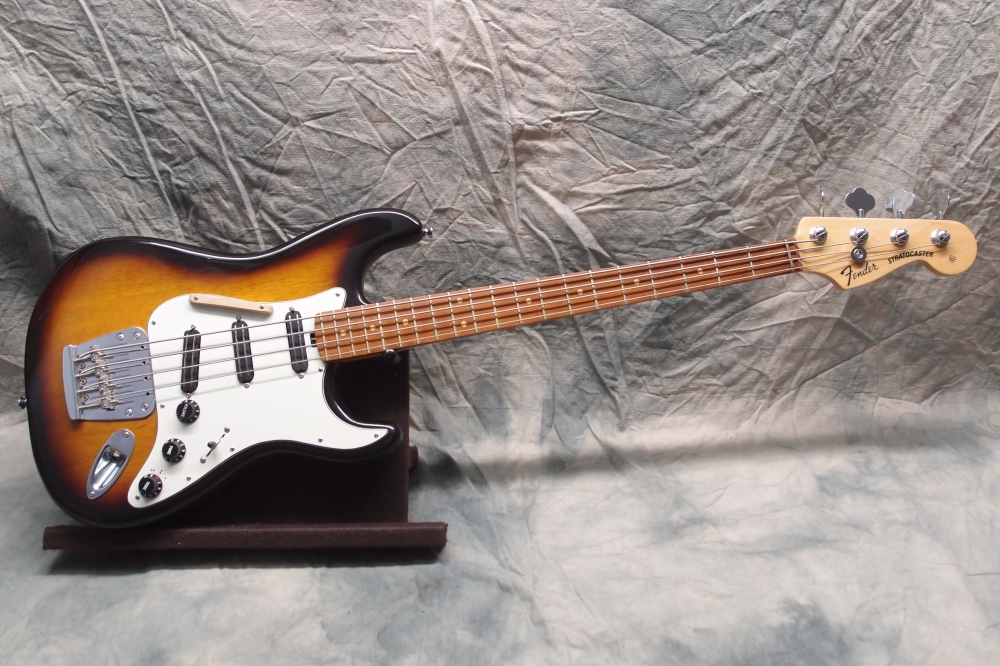
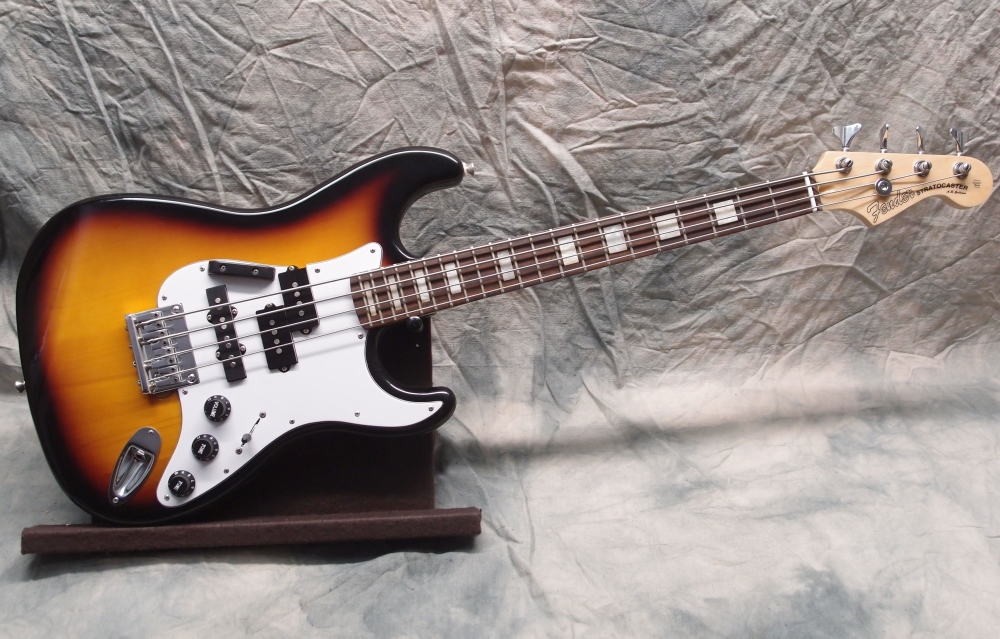
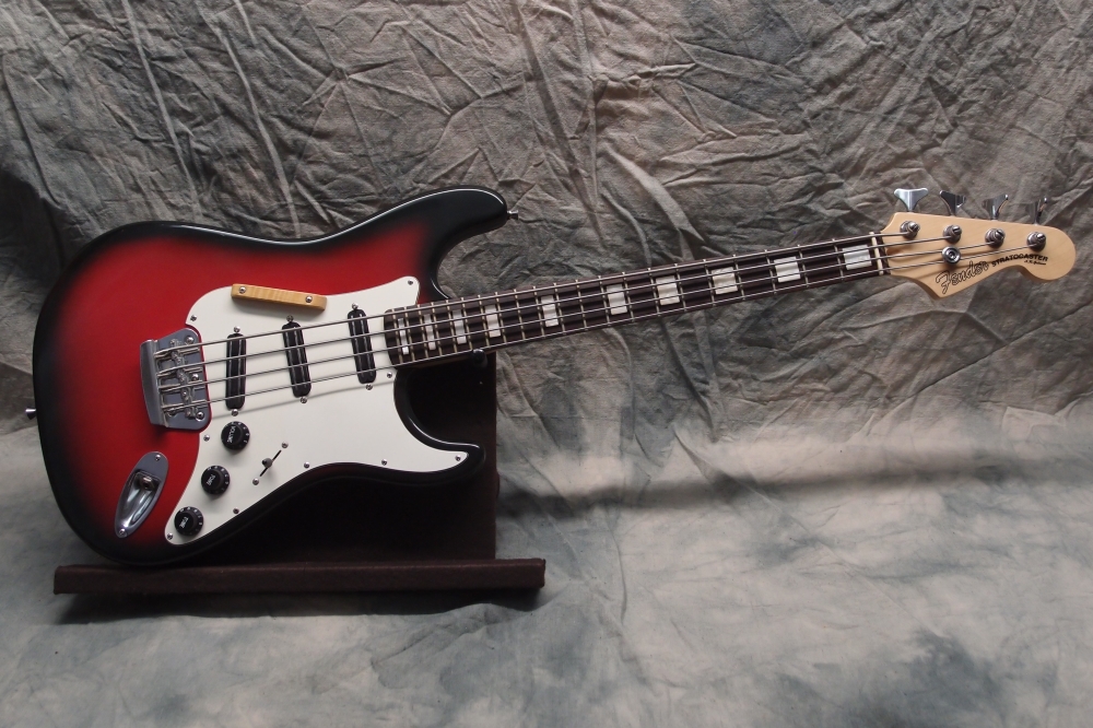
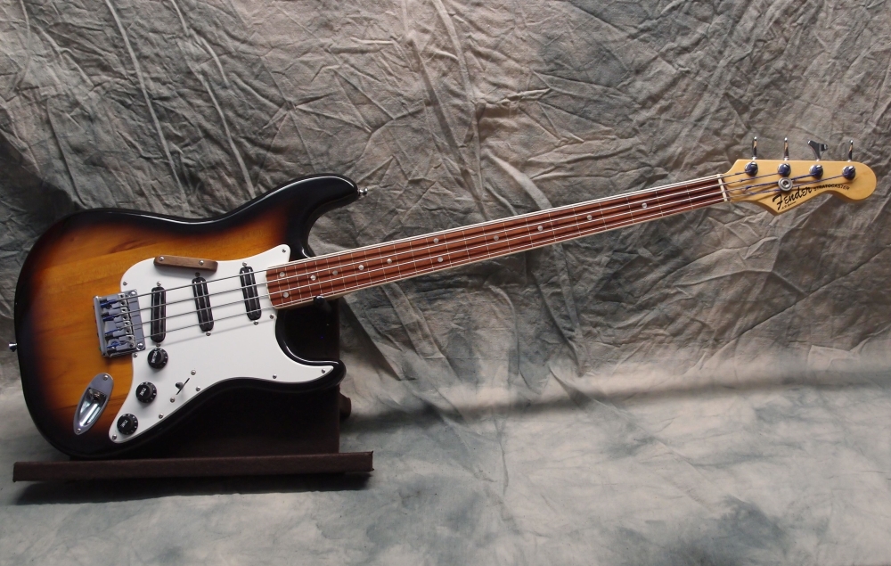
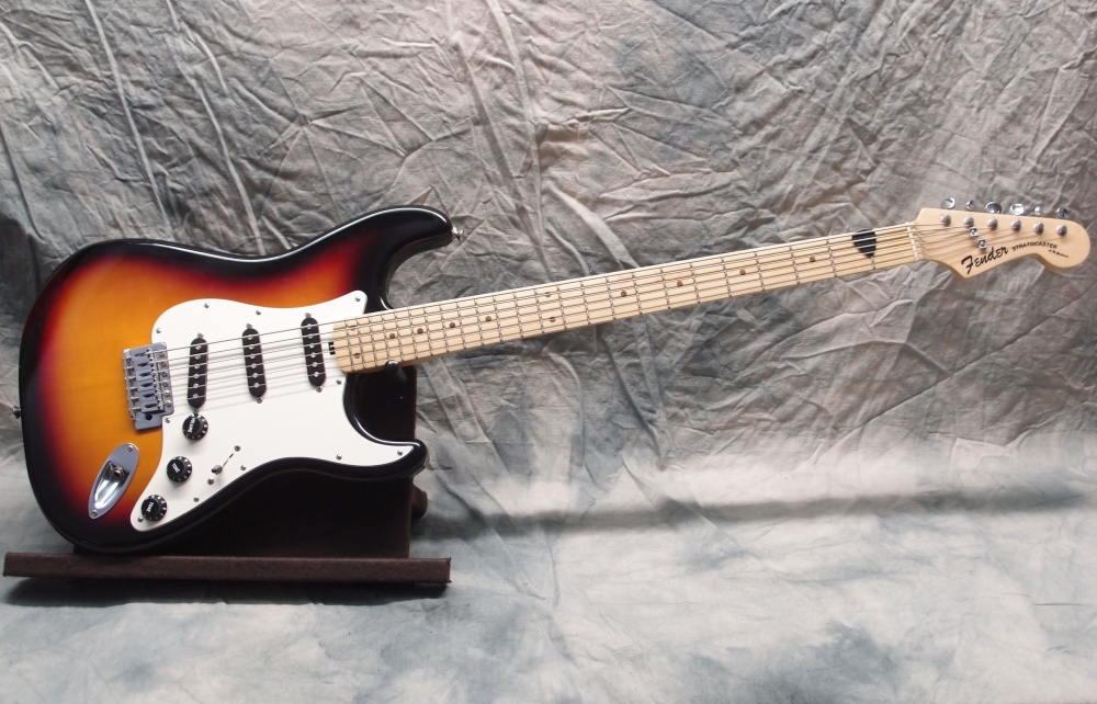
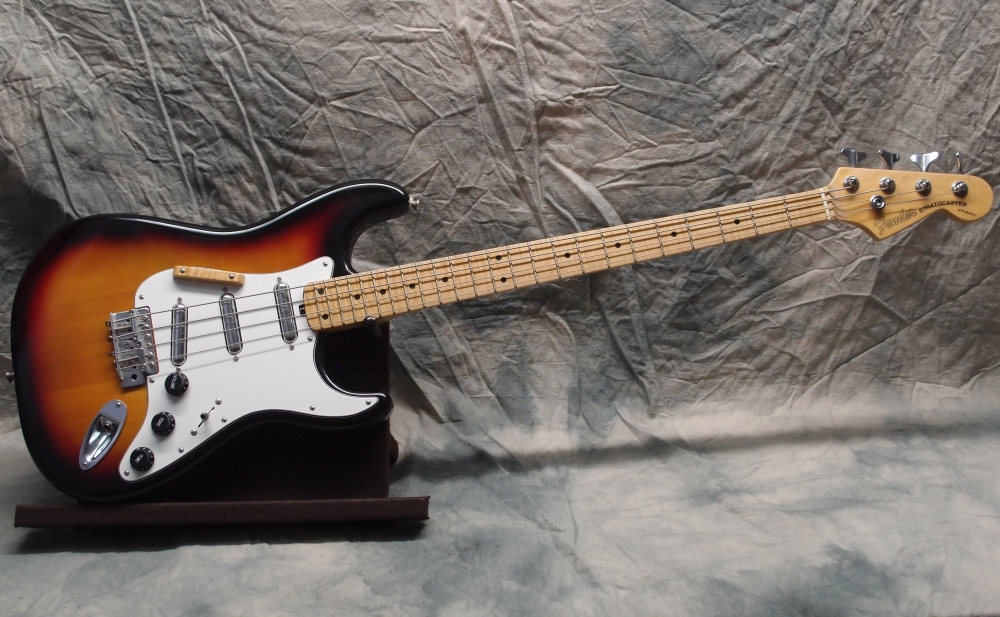
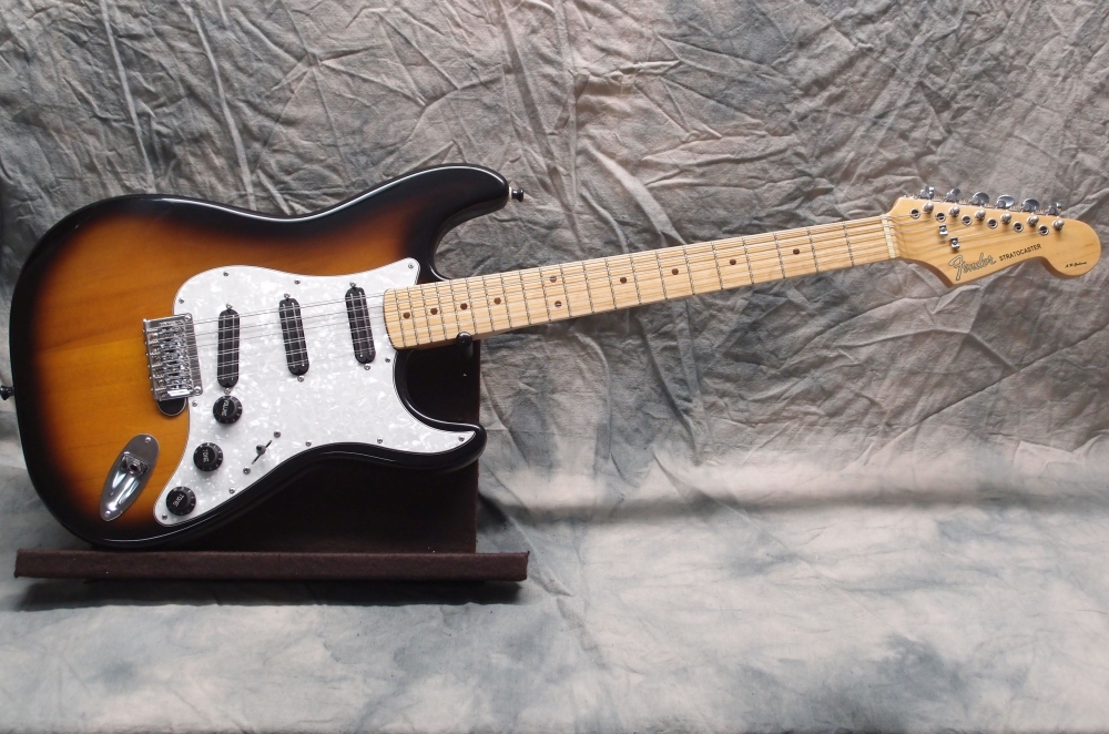
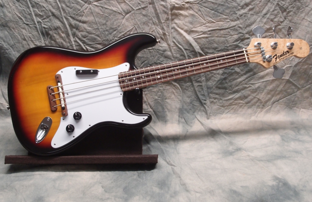
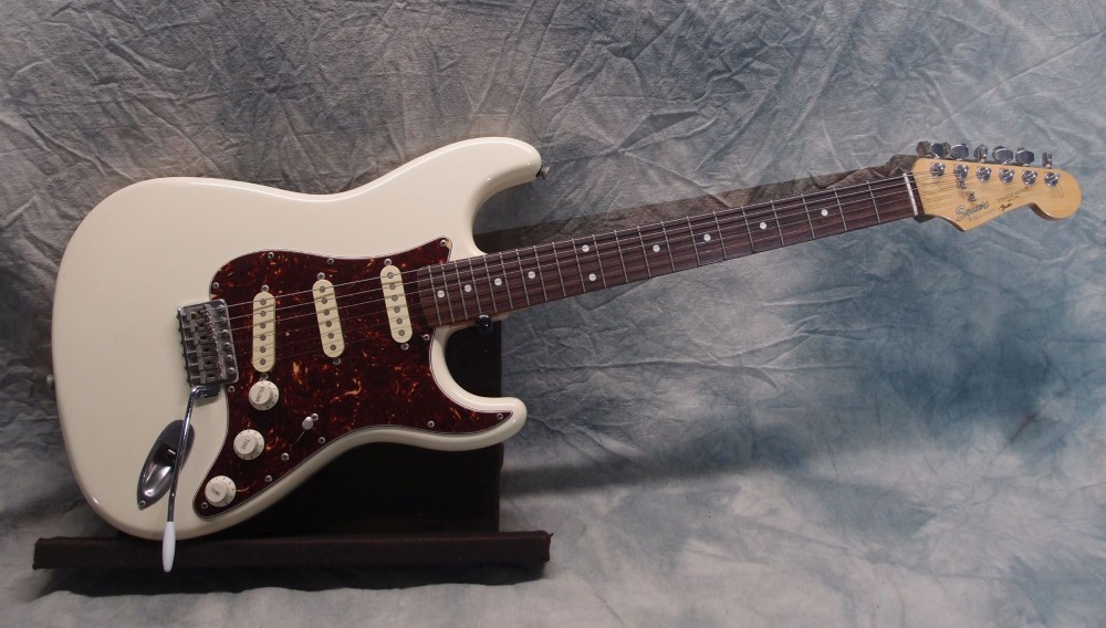
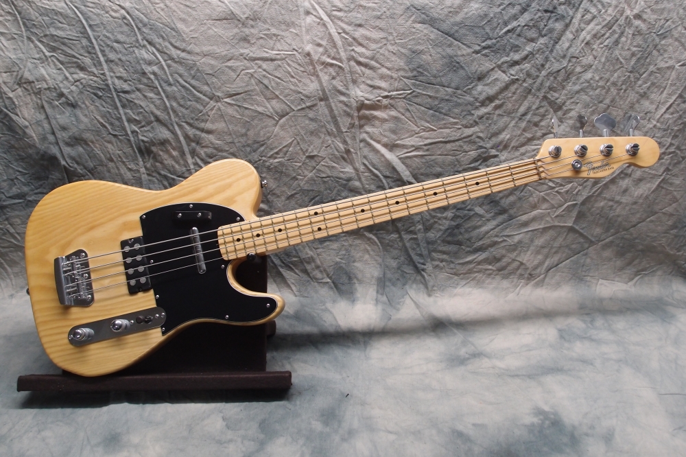
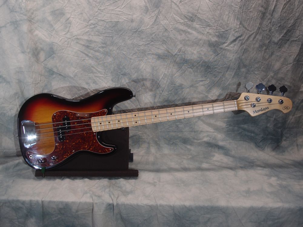
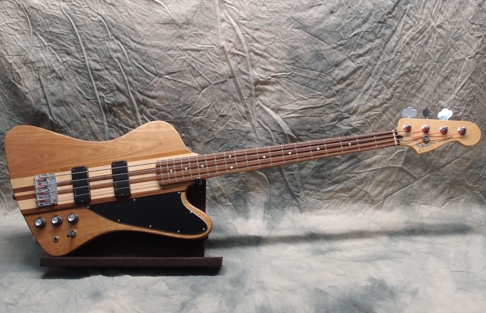
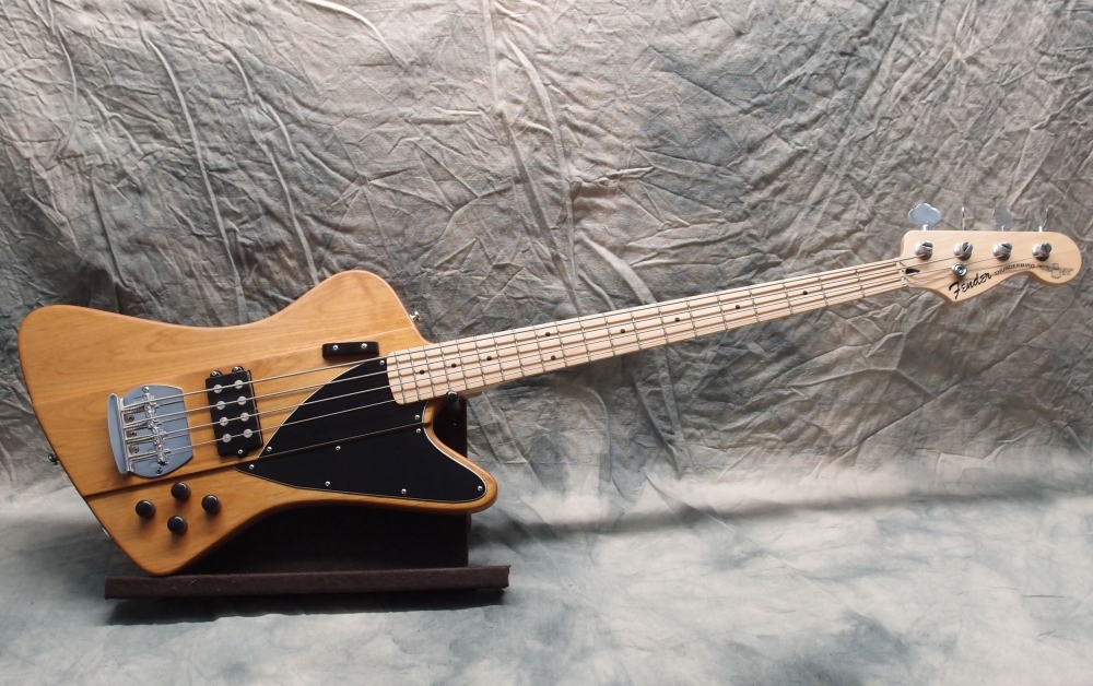
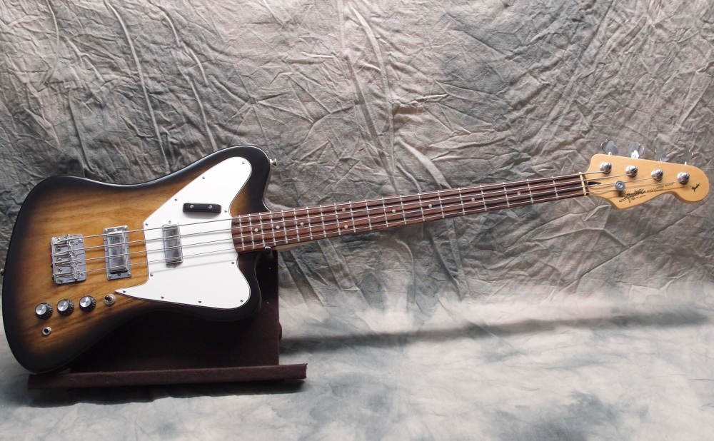
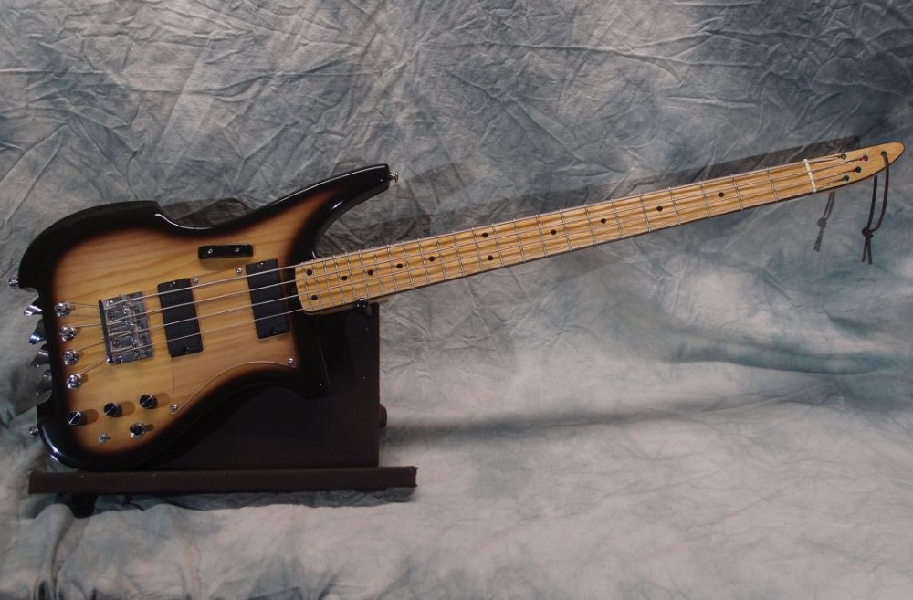
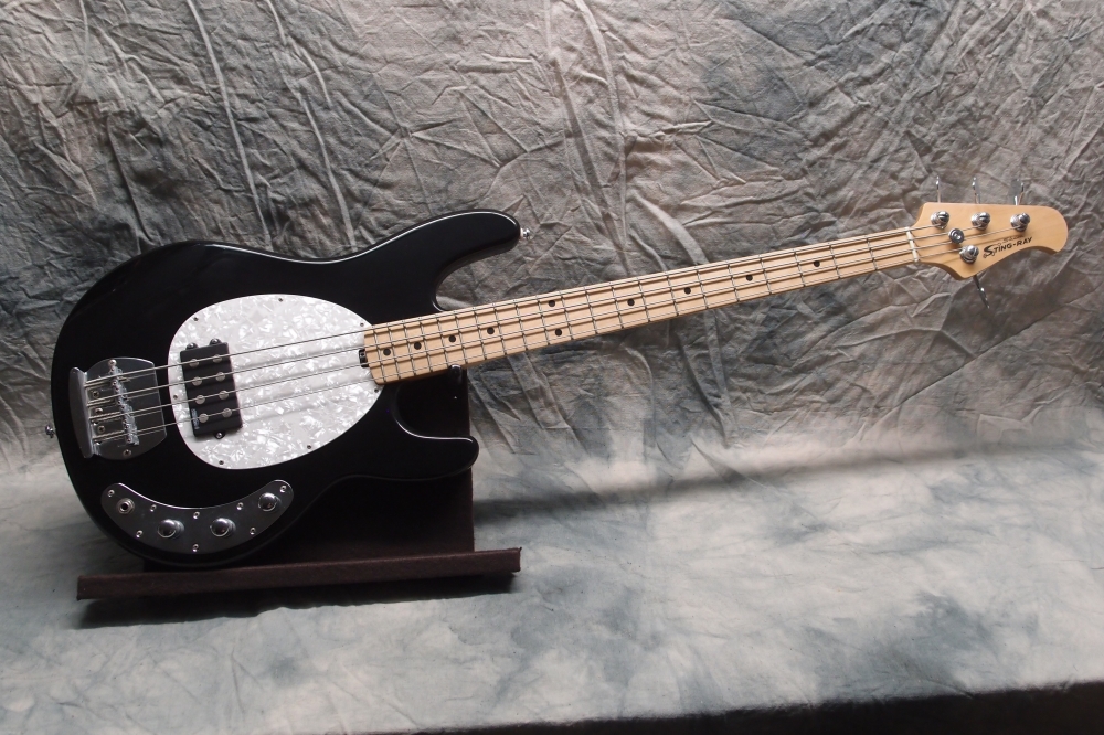
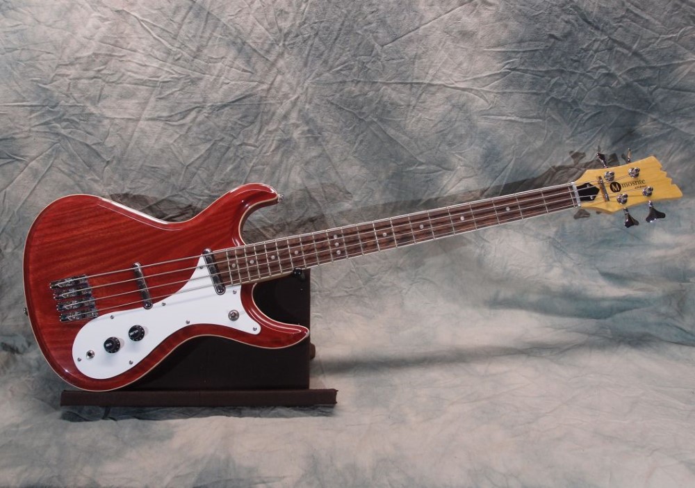
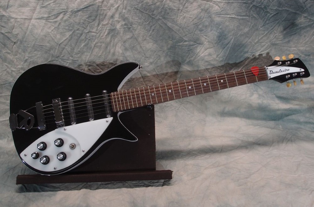
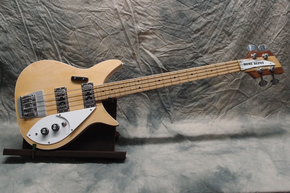
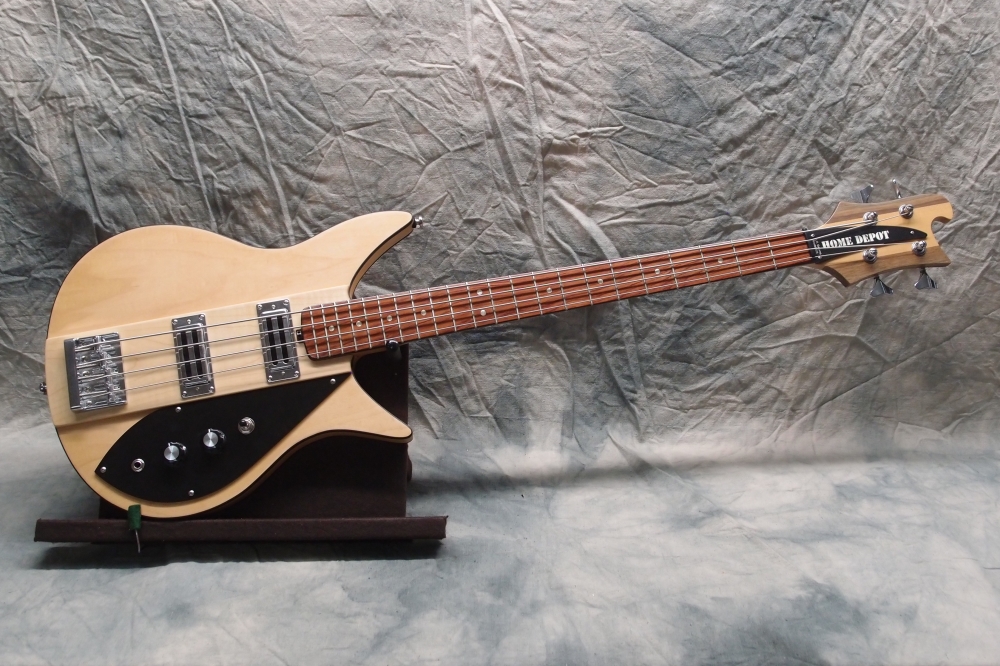
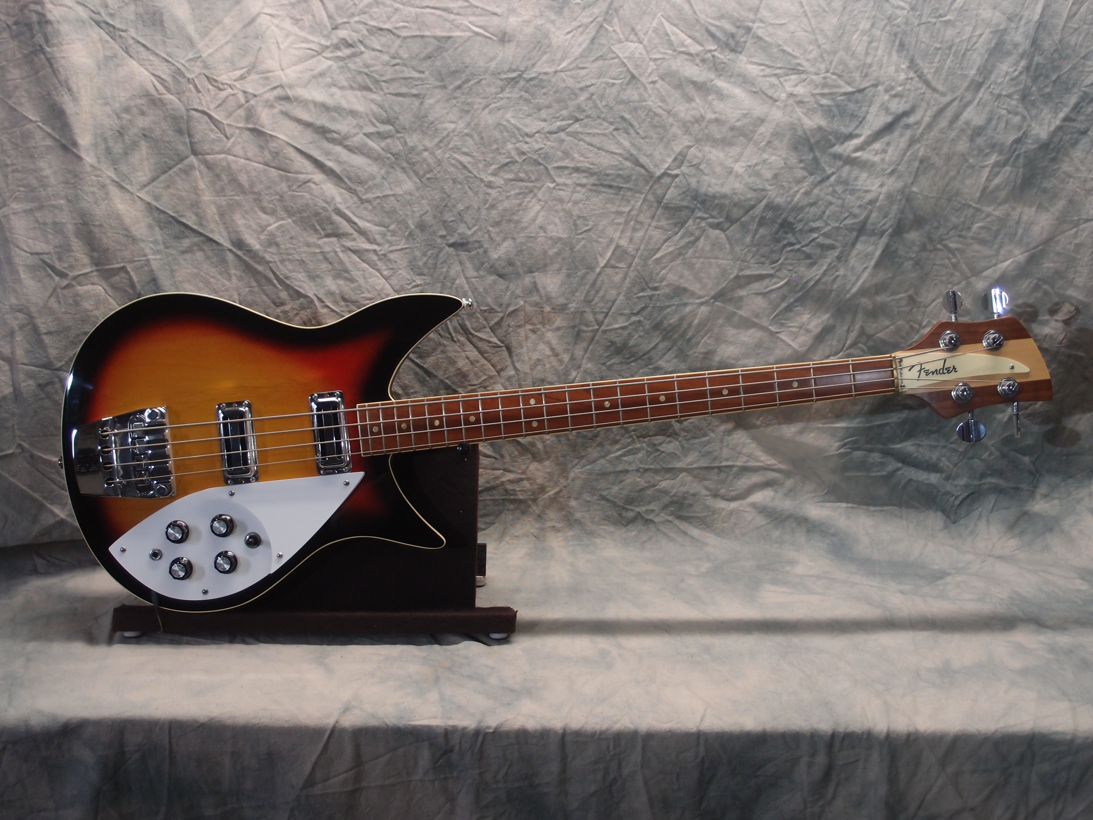
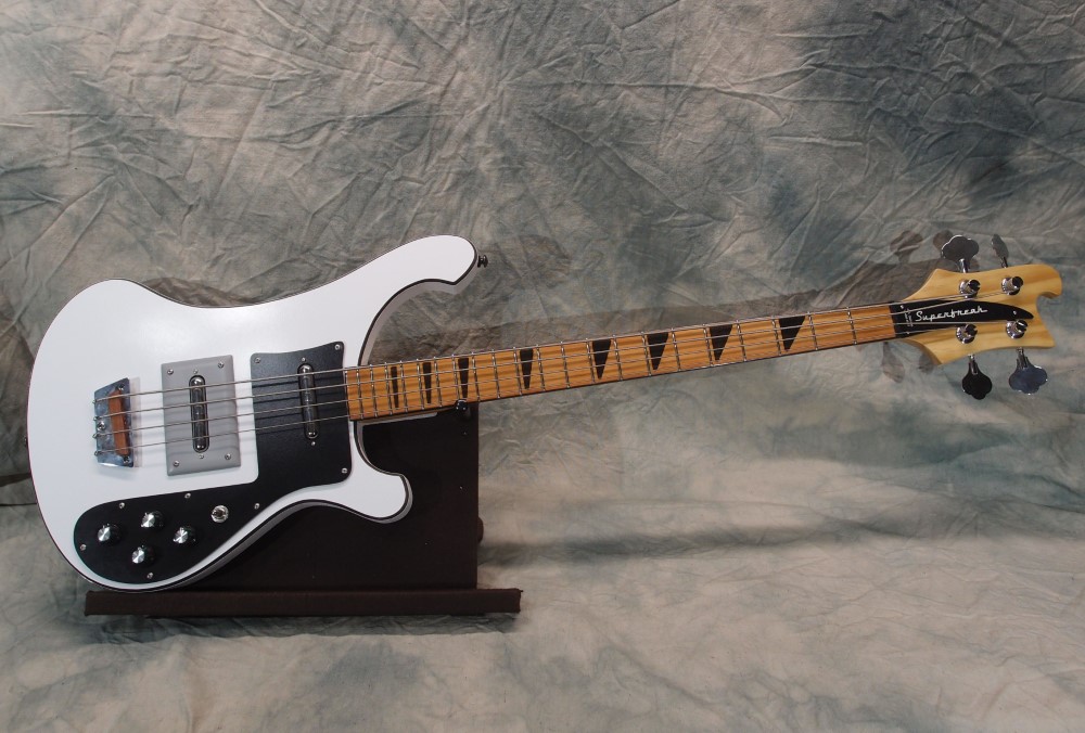
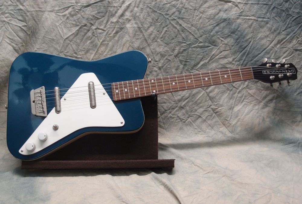
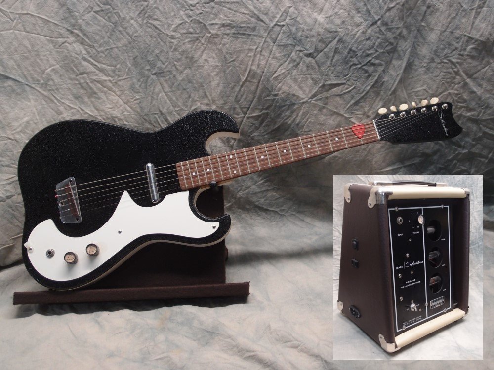
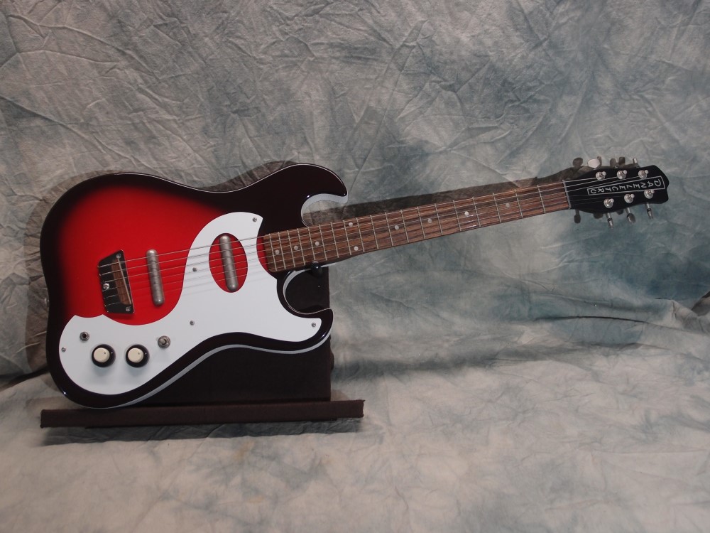
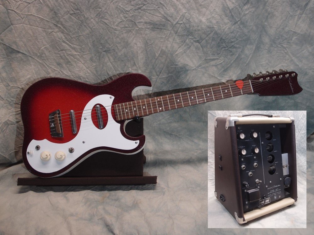
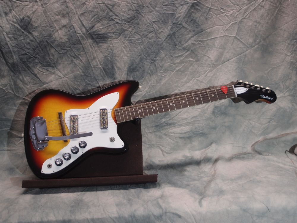
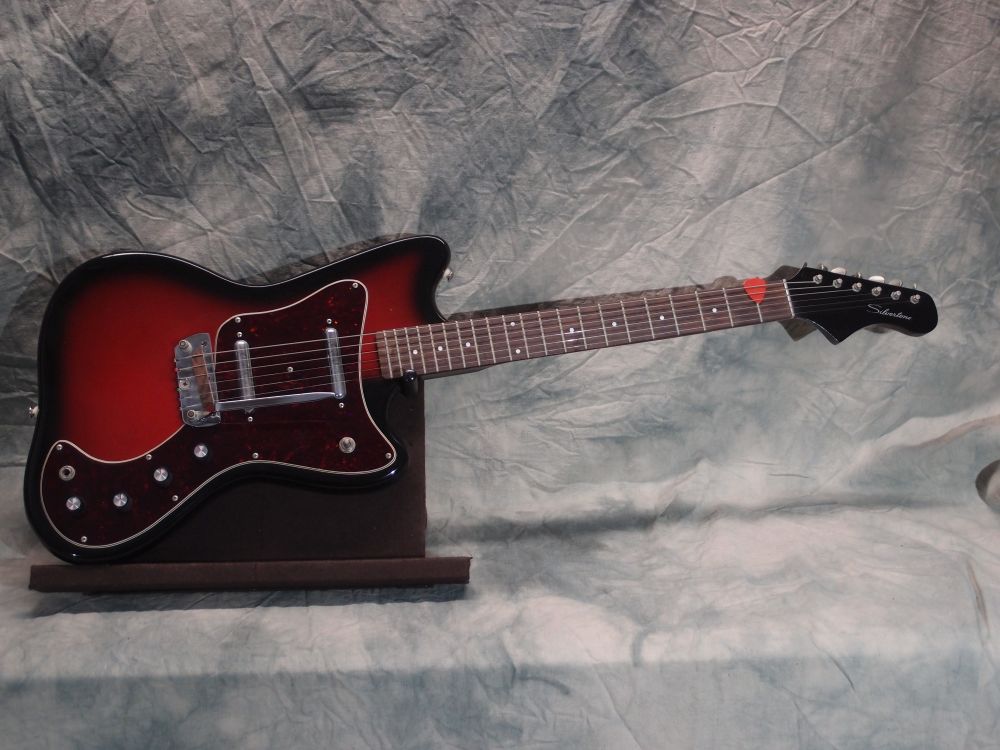
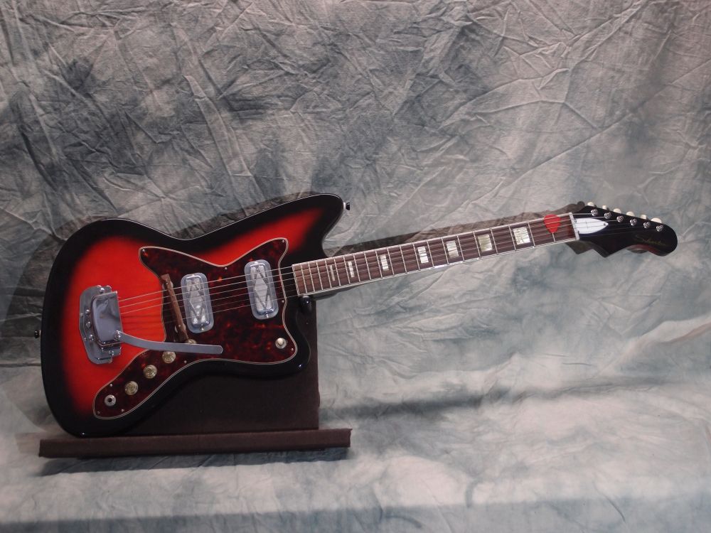
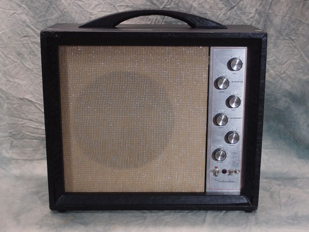
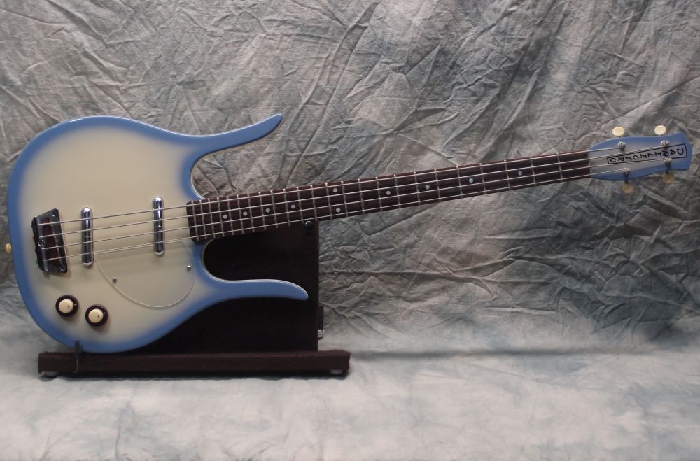
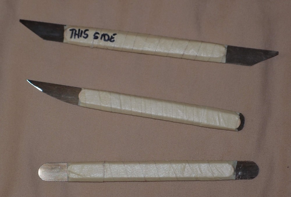
The original buttons were white/transparent and readily disappeared against light or highly textured backgrounds. My new arrows are visible against almost any background, even when they are almost completely transparent. As you can see above, they even work well against the difficult photographic background.
The trick to this is to use two opposite colors, and the best colors are black and white. You can see that the core of the arrows is white. There is a thick black border around that, and finally a thin white border around the black border. No matter what the background is, some part of this pattern is going to stand out. And I'm not even a graphic designer, I'm actually an engineer by training.
One thing I did not touch is the base Nivo Slider jquery code. That way, if there is ever a new better version, I can just drop it in. I treat WordPress itself the same way - never modify the core. If you want it to do something different, get clever with external modifications, which is the whole point of writing my own theme.
Update Again
I have merged dozens of tiny PHP files into several reasonable-sized ones, which makes editing the code much easier. I have stripped-out so much bad code that even after merging most of the PHP files, the largest text file in the plugin is the license agreement!
At the same time, I have added many useful new features and options. In making the back-end much more functional, I also made it beautiful - I wish you could see it. There's an old saying in aerospace: "If it looks good, then it is good." There's another saying: "Simplify and add lightness". That should be Programming 101. Alas, it is the opposite.
The original author of this plugin must have been scared silly by the object-oriented monster. I've never seen so much pointless classing and re-classing and one-time inheriting and all sorts of other stupid programming tricks that are really only useful in college to impress your prof.
Generating Nivo Slider scripts is not all that complicated, and it doesn't require all that object-oriented goo. In fact, all the object-oriented complexity actually makes this plugin more difficult to work on, not easier. In the real world, small and simple is the way to go. ( Someone should tell Microsoft. ) Someday I may do a ground-up rewrite that will come out half the size and twice as fast. And I already made it half the size and twice ten times as fast as what it was!
That said, I couldn't have written this from scratch, I don't have all the expertise in WordPress, Ajax, JQuery, etc. I can pull apart someone else's code, and complain about it, and make improvements. That's called 'maintenance programming', and it has always been my strong suit. Remember Y2K? Anyway, hats off to the guy who wrote the original, even if it left much to be desired.
One thing I removed completely was 'custom themes'. I don't want a slideshow to have a 'custom theme', I want it to fit seamlessly into my website - the same look and feel without having to do anything special. So I stripped the built-in CSS down to just what is necessary for layout and operation. Visual styles like fonts and colors default to whatever is set for the parent website, although it is easy to externally 'css' a slideshow and make it look any way you want.
Final Update
While cutting away fat, I have also been adding features. The slideshow now has a nifty private preview feature that lets you check a slideshow without actually installing it anywhere. I also added a capability for a default link that is applied to every slide. Most of the features I have added only take a couple of lines each, while at the same time I have cut away hundreds of lines of garbage that did nothing important, some that did nothing at all.
The slideshow manager is also so much better - you can now see all the settings for all the slideshows at a glance, including thumbnails at the specified size. Anything that is not right pops out in red, for example - a slideshow that has no user controls and no auto-run. The slideshow editor is now much better organized as well.
One thing that I liked about this plugin from the start is that slideshows are implemented as custom posts. They are stored in the posts table and are managed like any other posts, leveraging all the functionality that is already there in WordPress. That is why I was able to easily add a preview feature - it was more a matter of un-crippling the original code than writing from scratch. The additional code to complete that feature was about half a dozen lines.
I think I have cut away everything I possibly can. Originally, the plugin was 310 kB of PHP code in 44 files, in a deep labyrinth of folders. Now it is 61.3 kB of PHP code in 5 files in one folder. The javascript and CSS files shrank similarly. The original total install size was 666 kB.** It is now 135 kB, of which 35 kB is the GNU public license and 24 kB is the Nivo Slider jquery file. It still seems bloated to me, but I would have to do a complete non-OOP rewrite to get it down to what it should be, so I will leave well-enough alone.
** Incredibly, that is actually the 'lite' version. I wonder what the heavy version looked like? Probably bring the server to its knees.
Better Smaller Faster should be every programmer's mantra. Unfortunately, it is the opposite. Especially from overseas, I see code that is either grotesquely incompetent or purposely bloated to convince the dopey customer that they are getting more for their dollar. 'Offshoring' a software project can be a disaster, I've seen it with my own eyes.
Post-Final Update
I made a number of improvements to the back end, especially the slide management. I also gave the code an overall streamlining and found a last few things I could delete. However, my additions have bulked it up to 63.5 MB. I guess I can live with that.
One thing that has become clear as I cleaned up the mess is that the PHP back end is not wedded to the jquery front end. I could add a different jquery slideshow if something sexier came along. But I'm pretty much a slow fade kind of guy, and Nivo Slider does that pretty well, so I am content for now, and tired of working on this.
One More Update
I did a total re-write of the shortcode handler. Now the plugin has a true random mode, without sacrificing efficient caching, two things that are normally at cross-purposes. The cost of this was one extra database call. I hard-wired some useless features and added a lot of new ones. After some ruthless code-culling, I finally got the total PHP size under 60 kB and 4 files, while the jquery has shrunk to a mere 9 kB and the CSS is just 4 kB. And it is fast, I can detect no overhead for loading even a very large slideshow once it is in cache.
My "Simple" theme is actually quite complex, and I could not come up with a reliable way of predicting when the slideshow CSS file needed to be included in the HTML <head>. So rather than including it all the time, I in-lined all the CSS. Bloated up my razor-thin PHP code, but sometimes you have to do what you have to do.
Then DAMMIT I noticed that multiple slideshows on a page interfered with each other. I traced that to a multiple CSS issue, which was not too hard to fix, since I can modify the inline CSS in PHP. This is getting close to a release version, I may put it up in the WordPress plugin store.
