December 1, 2019
Website Improvements
December 1, 2019
... consistency is the hobgoblin of little minds ...
I re-worked the default WordPress TwentySixteen theme into something far better. Not only is the display much more streamlined and compact, but the code behind it as well. The people who design these things overkill them into an unmanageable mess. Most of what I did was simply deleting miles and miles of repetitive unnecessary css spaghetti code and replacing it with just a few new lines. Most developers seem to think that more code is better. That is so wrong.

This post needed some color. I think the new layout looks and works great on everything from my hi-rez laptop to my tablet to my phone. While I was at it, I bulked-up the menu system and then deleted it, as well as the header image. That way you get right to the meat of things, without having to scroll every page past a lot of useless eye-candy. I also started a links page. Finally, I folded my custom navigation plugin into the theme, so that it can't be accidentally disabled.

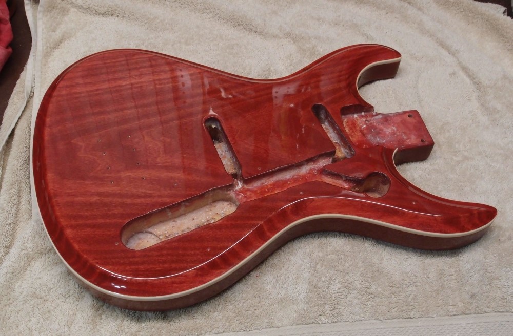
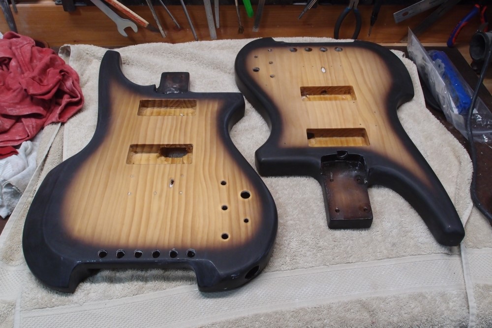
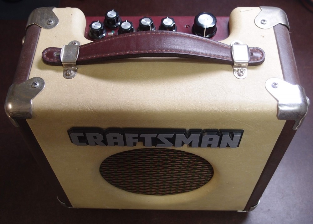
I also did some work on these. I think everything looks great !!!

