December 7, 2019
Web Design
December 7, 2019

I coded up a pretty spiffy popup menu system for small displays like phones and tablets. If you're on a small device, you get it automatically. You can force it on a large display by making the window narrow.
Also, time for a rant. The people who came up with 'responsive web design' are a bunch of idiots. It doesn't work. It can't work, and there is a simple reason:
There is no way to detect the real-world physical size of the display. You cannot get the physical size of the screen your end-user has eyeballs on. Without that, everything else is pointless. Nor is there any reliable way to detect a touch screen, and nowadays even if you could it wouldn't mean much - everything is a touch screen now.
Perhaps someday browser software will have access to dpi, or maybe even the actual physical dimensions of the display. Together with screen pixels and a little math, that might finally give you a way to design a website so that, say, the font size doesn't shrink away to nothing on a phone. On the other hand, with virtual pixels, and 4k Retina displays, and lord-knows-what-is-to-come, I doubt "responsive web design" will ever work right.
The current paradigm of responsive web design is completely wrong. However, a bit of that wrongness can be used to get a desirable result, and that is what I have done here. Web gurus will howl, and Gargle analytics complains about it, but it works.
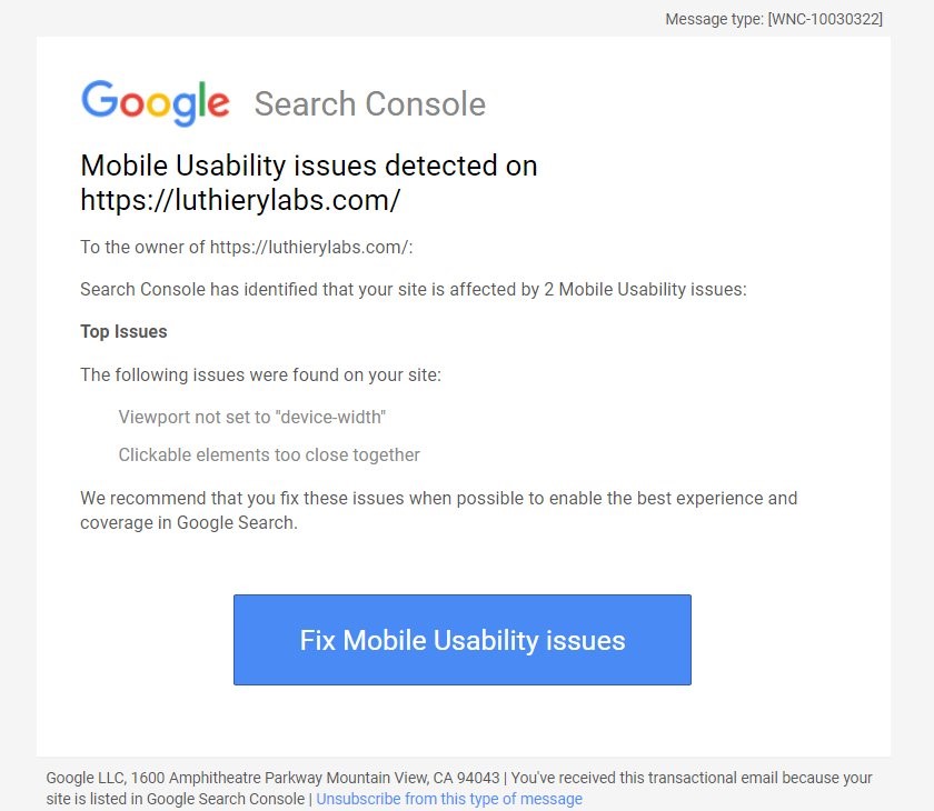
Gargle wasted no time in sending me this hate-mail. Funny for them to be telling the world how to code, Gargle has always had the worst web developers anywhere. They are just really, really BAD.