Web Stuff (4/5)
Notes on WordPress, php, html, css, search engines, and anything else that I think is worth remarking on.

I coded up a pretty spiffy popup menu system for small displays like phones and tablets. If you're on a small device, you get it automatically. You can force it on a large display by making the window narrow.
More: Web Design ...
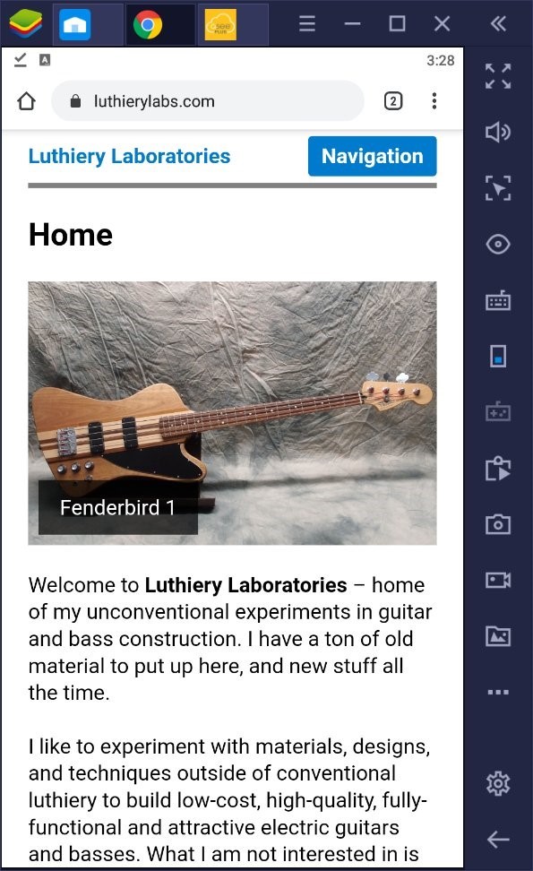
Here is a screen capture of this site running in a phone-sized Android virtual machine on my laptop. The site adapts perfectly to every screen size and every device, from a dinky smartphone all the way up to the biggest PC, with no loss of usability. Yet the code behind it is bit-for-bit exactly the same on every display. That's pretty incredible.
More: Website Design Finally Finished ...
... consistency is the hobgoblin of little minds ...
I re-worked the default WordPress TwentySixteen theme into something far better. Not only is the display much more streamlined and compact, but the code behind it as well. The people who design these things overkill them into an unmanageable mess. Most of what I did was simply deleting miles and miles of repetitive unnecessary css spaghetti code and replacing it with just a few new lines. Most developers seem to think that more code is better. That is so wrong.
More: Website Improvements ...

I set the site up earlier this year, using one of the default WordPress themes - TwentySixteen - and some code I wrote myself. The big push then was to get all the old content into the new system and somewhat organized. It was a huge amount of work just to get everything 'good enough', and then I let it lie.
More: Website Redesign is Finally Done ...

WordPress 5.5 just dropped, and once again they have made a complete mess of image handling. Now every image is smeared out in the vertical direction.
More: WordPress 5.5 ...

WordPress 5.9 just dropped. A 0.1 release like this always makes me nervous, but you can't hold back the tide, so I tested it on another site, and nothing broke. At least I haven't found anything yet. So I updated this site, and everything still works, at least at a glance.
More: WordPress 5.9 ...

It seems the WordPress team has been busy adding "features" to the new versions. Features that raise html errors. Otherwise known as bugs. I added some code to defeat the new "functionality". WordPress really needs to get some good product testers. Testing is just as important as writing buggy code in the first place.
This is a very useful tool:
More: WordPress Again ...

WordPress suffers from misguided ideology, bad programming, and arrogance, usually all at the same time. Case in point: image handling.
Image handling in WordPress is pure insanity. Left to its own devices, WordPress will create multiple copies of every image at many sizes. This creates a pile of garbage on the server, roughly doubling the disk space used, sometimes worse. And they are so sure they are right about this that there is no way to turn it off - not by settings, not by filters or hooks - no way.
More: WordPress Again and Again ...

Getting back in the saddle - I wrote the PHP code for the sidebar navigation, as nothing very good seems to exist in the WordPress world.
The main navigation node at the upper-right shows the path to where you're at with a breadcrumb trail, the page you're on, and any siblings and children. It also incorporates the Blog.
More: WordPress Coding ...


