December 16, 2019
Website Design Finally Finished
December 16, 2019
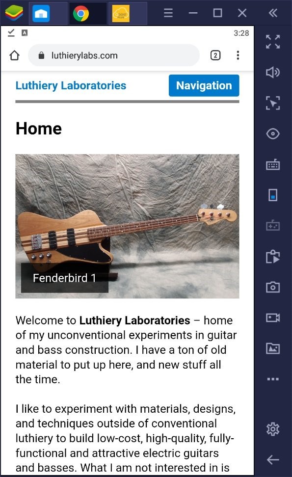
Here is a screen capture of this site running in a phone-sized Android virtual machine on my laptop. The site adapts perfectly to every screen size and every device, from a dinky smartphone all the way up to the biggest PC, with no loss of usability. Yet the code behind it is bit-for-bit exactly the same on every display. That's pretty incredible.